
Yellow as gold, money, and trust.
Amber and warm honey carry a classic Indian feel without leaning on cliche. Gold is the visual shorthand for value here.
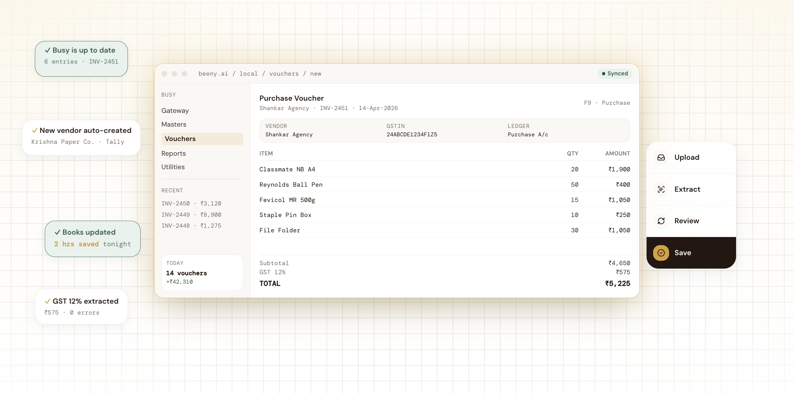
Beeny reads supplier invoices and updates the books in Tally, Busy, or Zoho. That's the product. The rest of this page is about what I made for them.
The founder pinged me with a hard deadline. They needed a marketing site fast, fast enough to convert customers and prove traction before applying to YC. Bigger budget for design wasn't on the table. Speed was.
So I scoped it tight. Brand identity, full marketing site, and the in-product UI flow, from blank page to deployed in five days. Built in Figma and shipped through Lovable, with copy and visual direction owned end-to-end.
Two anchors held the whole brand together. I wanted Beeny to feel like a tool that already belonged in an Indian small business, not a SaaS dashboard imported from somewhere else.
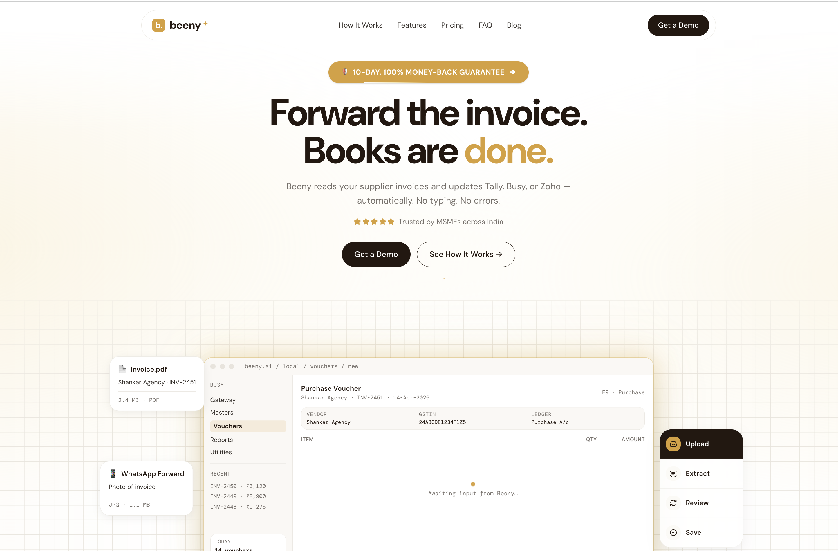
Amber and warm honey carry a classic Indian feel without leaning on cliche. Gold is the visual shorthand for value here.
The soft ledger grid breaks up the white, sets the accounting context, and gives every screen warmth a flat background couldn't.
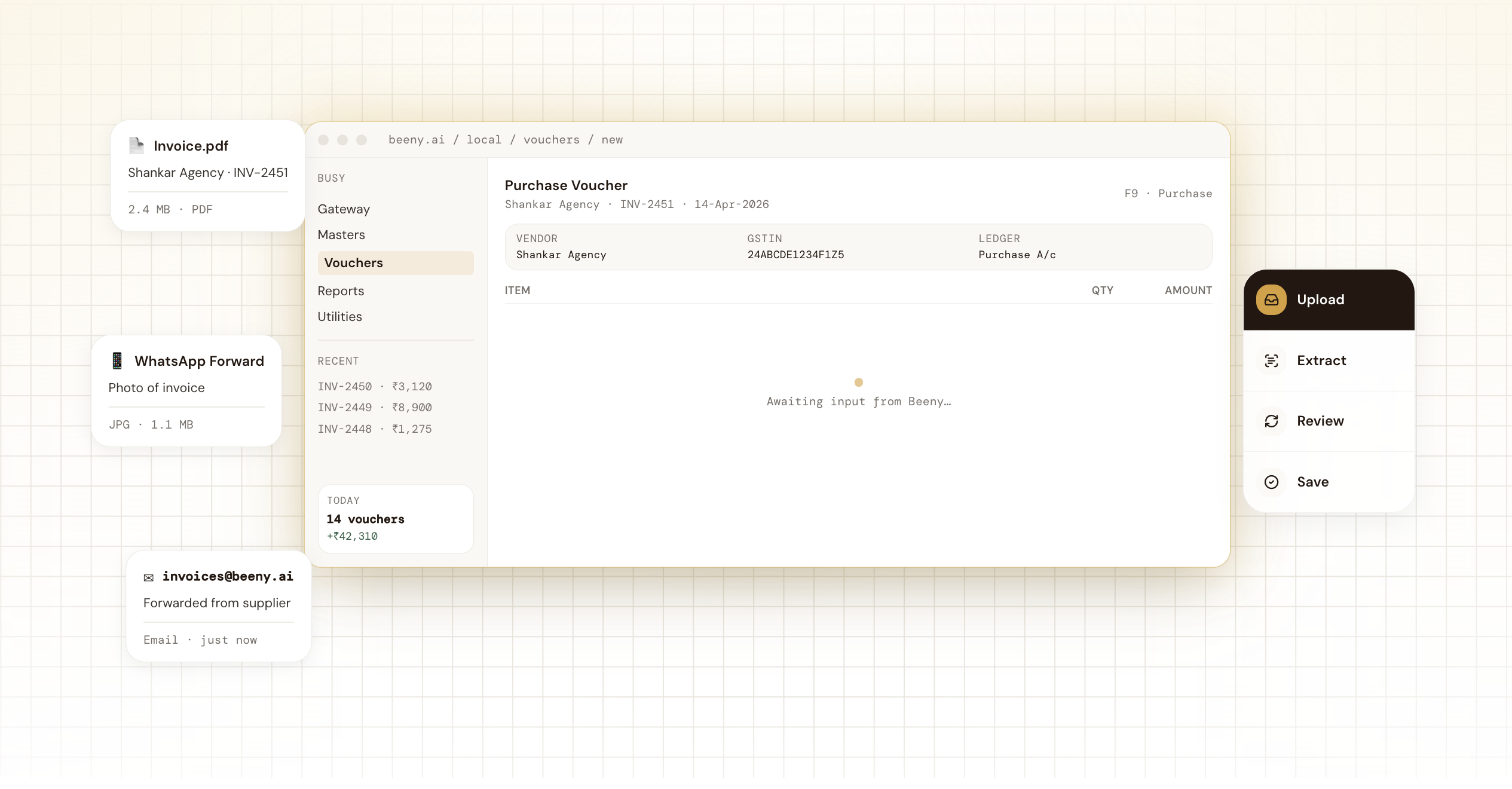
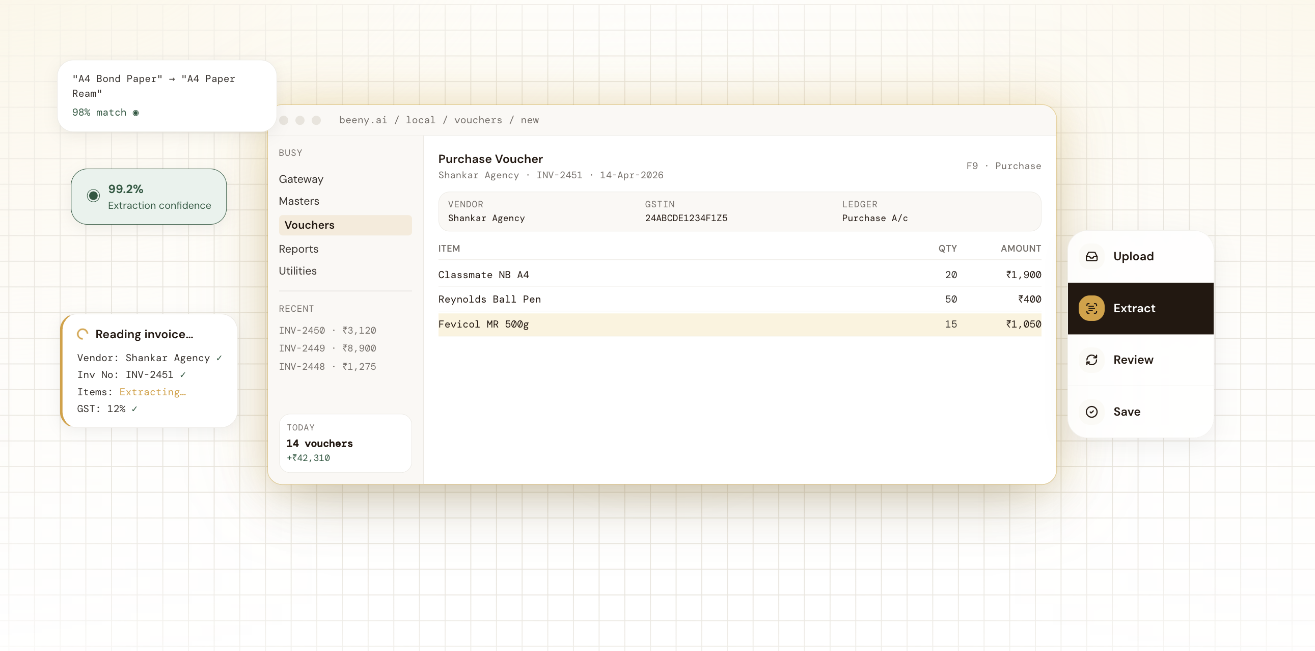
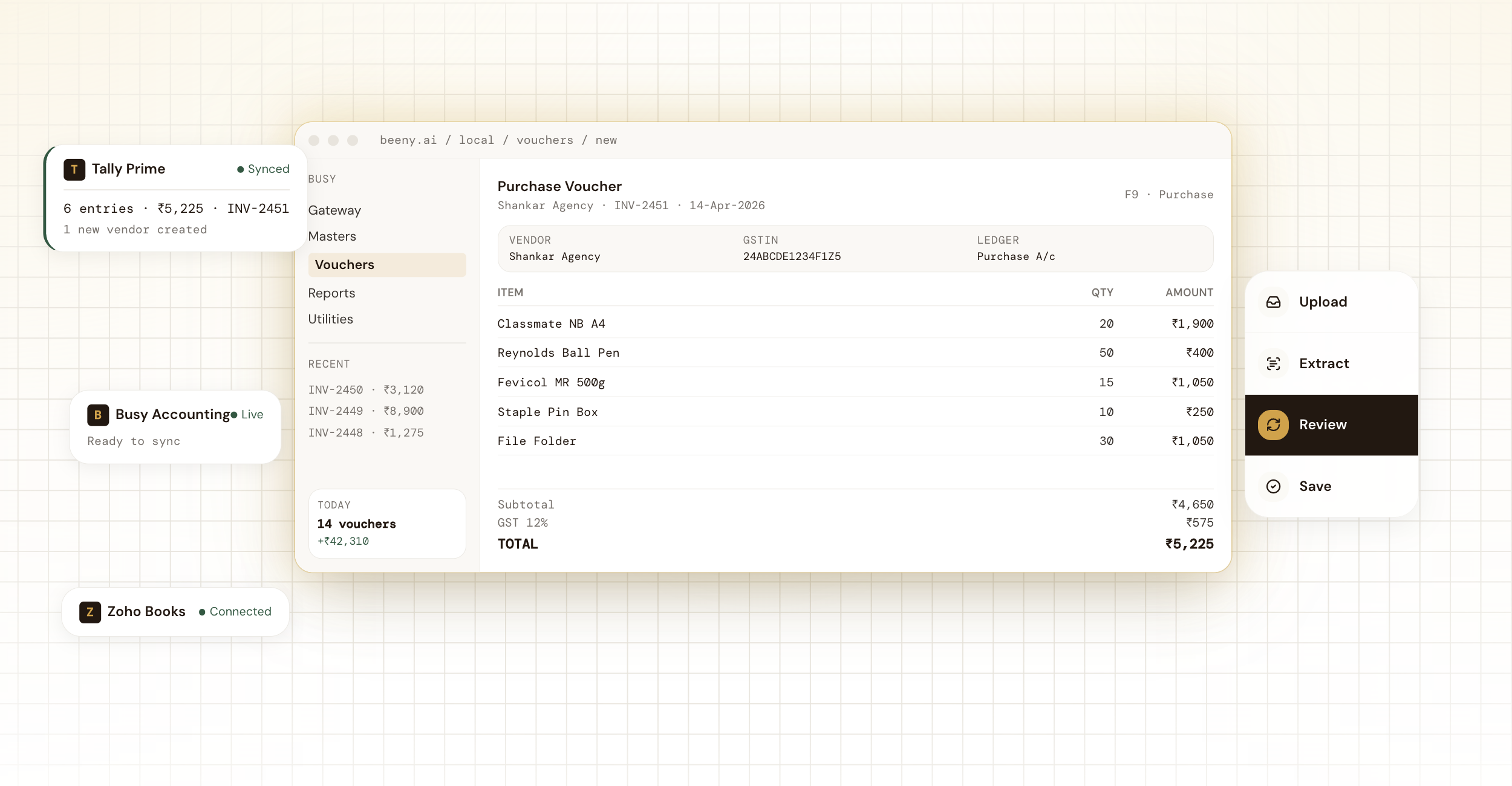
The founder asked for a product visual that did the explaining for them. I built a single canvas that cycles through Upload, Extract, Review, and Save, each state holding the same UI but shifting context cards on the side.
Most product sites in India default to English and stop there. I designed a real Tamil hero, with a handwritten ledger mock, to signal that Beeny was built for the user it actually serves. The screen below is mine, top to bottom.
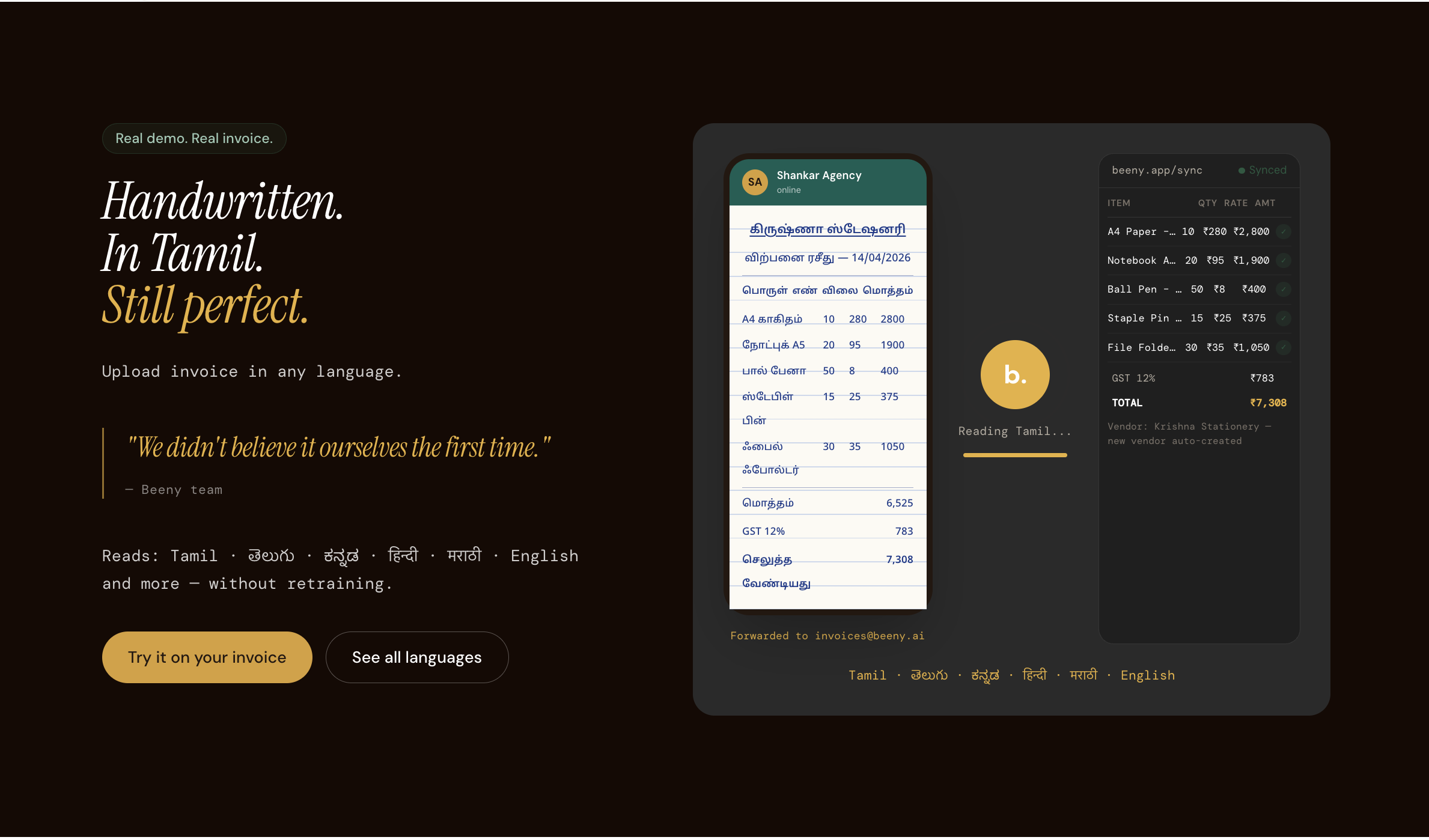
Tamil glyphs are denser than Latin. I picked a face with enough counter space to stay legible inside the same UI components.
The ledger uses real handwriting, real prices, and real product names from a stationery shop.
Showing this section first to MSME founders shifted the trust temperature in early demos.
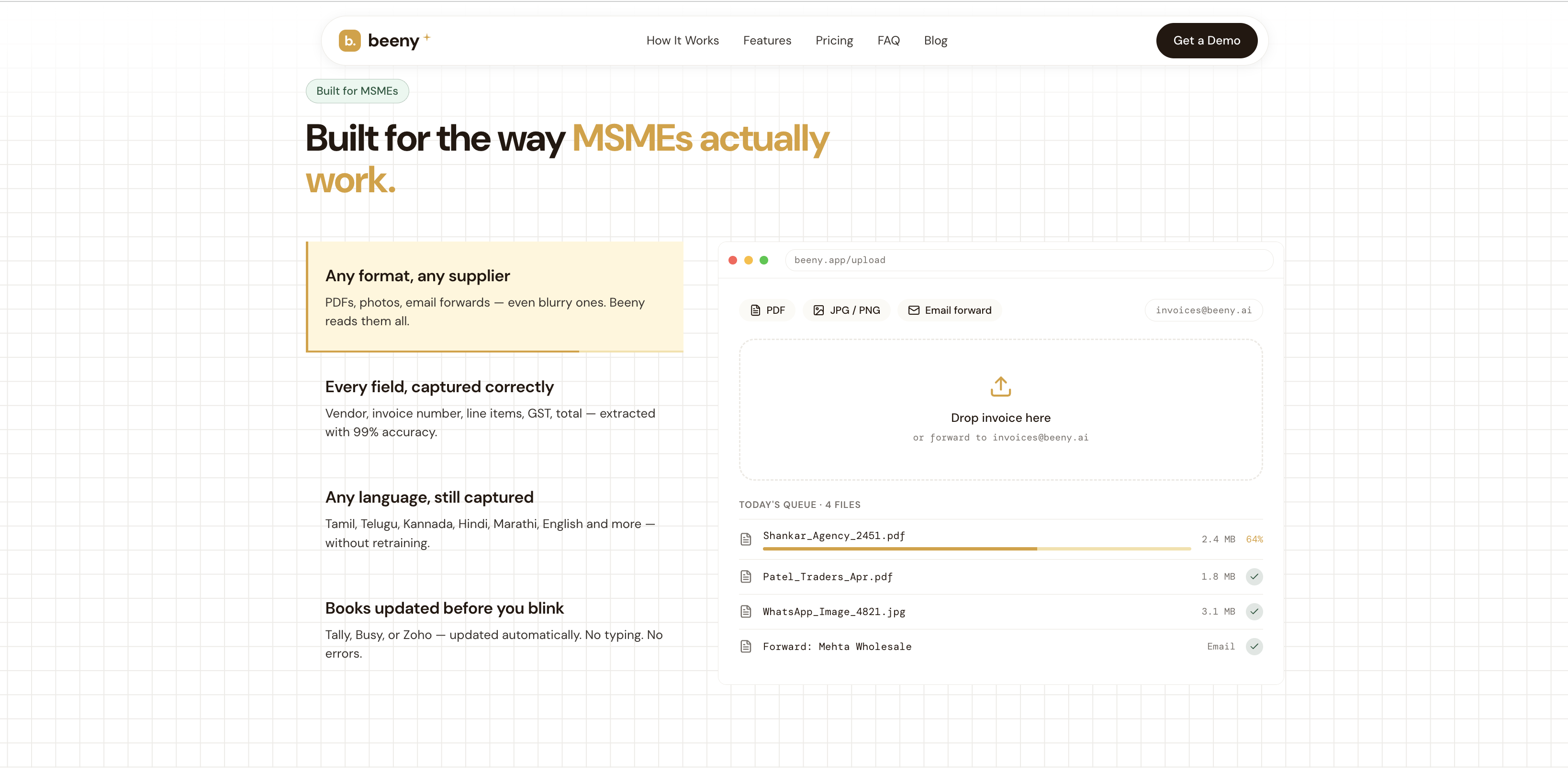
The MSMEs section was the hardest to compose. Dense product card on the right, four feature blocks on the left, and a need to feel calm at every width. Same hierarchy, same visual rhythm, restructured for a thumb.
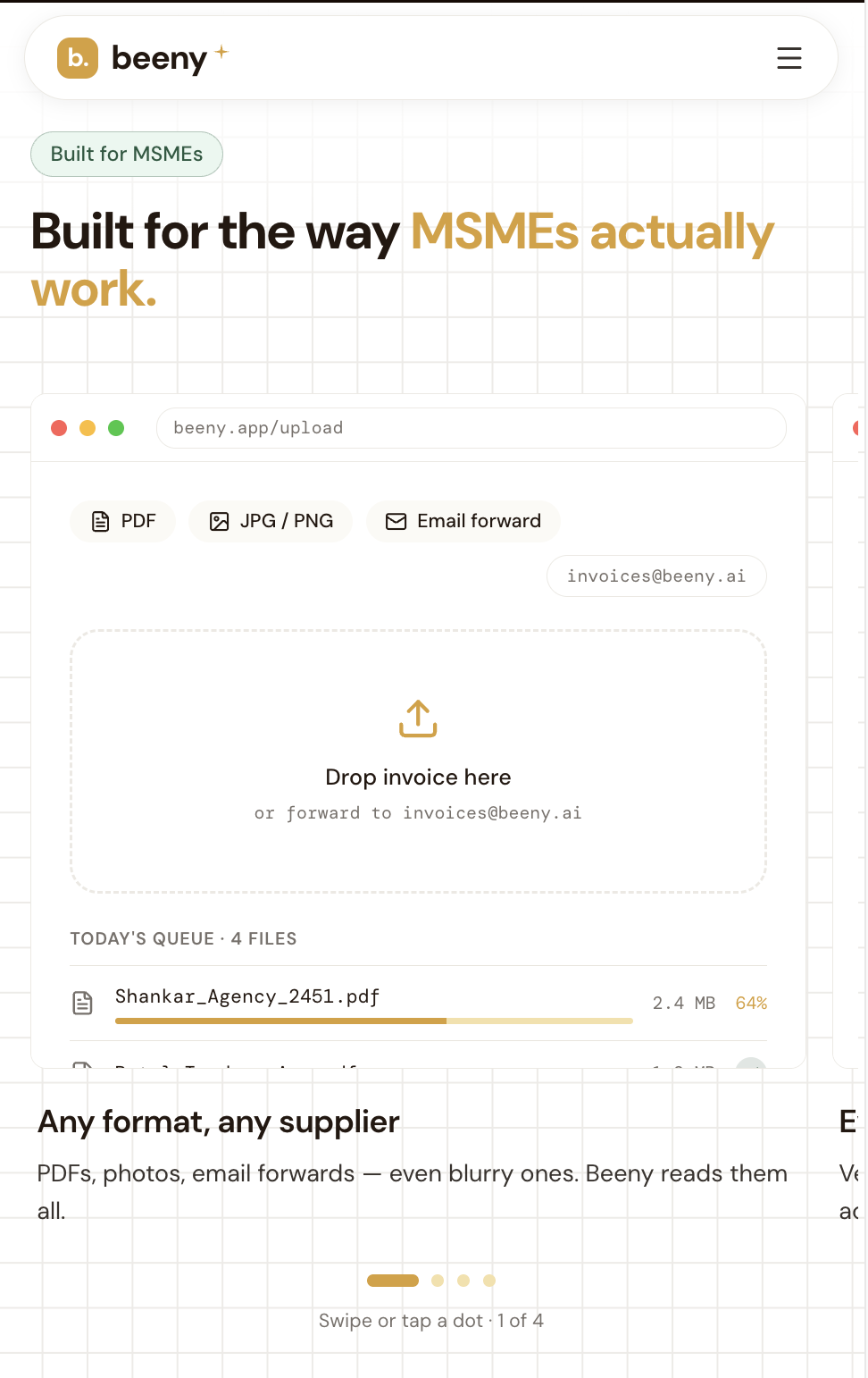
On mobile, the right-hand UI mock becomes a horizontal carousel of features so each one gets a full screen.
The same yellow card that calls out the active row on desktop tracks the carousel on mobile.
A small marketer-meets-designer choice that earned the most attention from the founder.
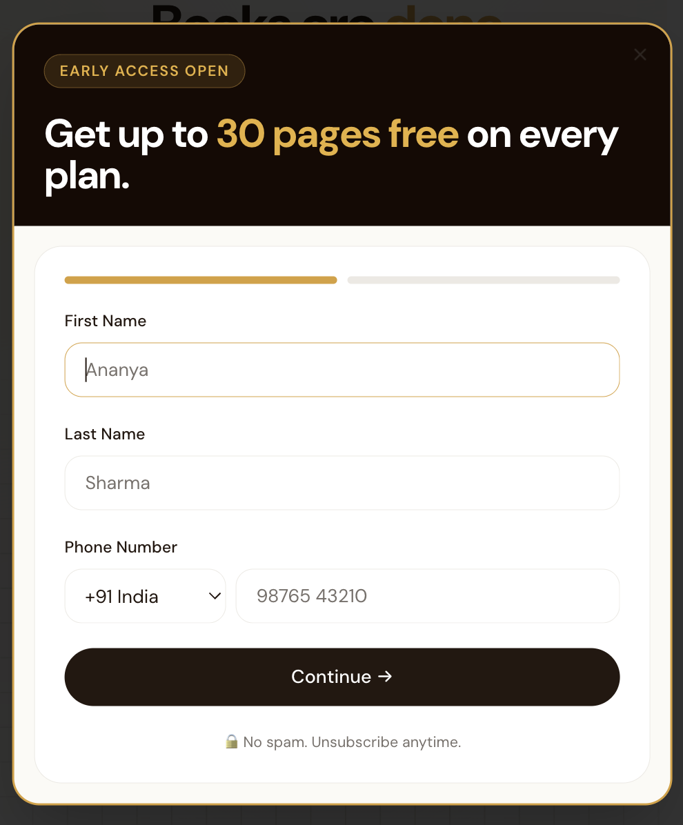
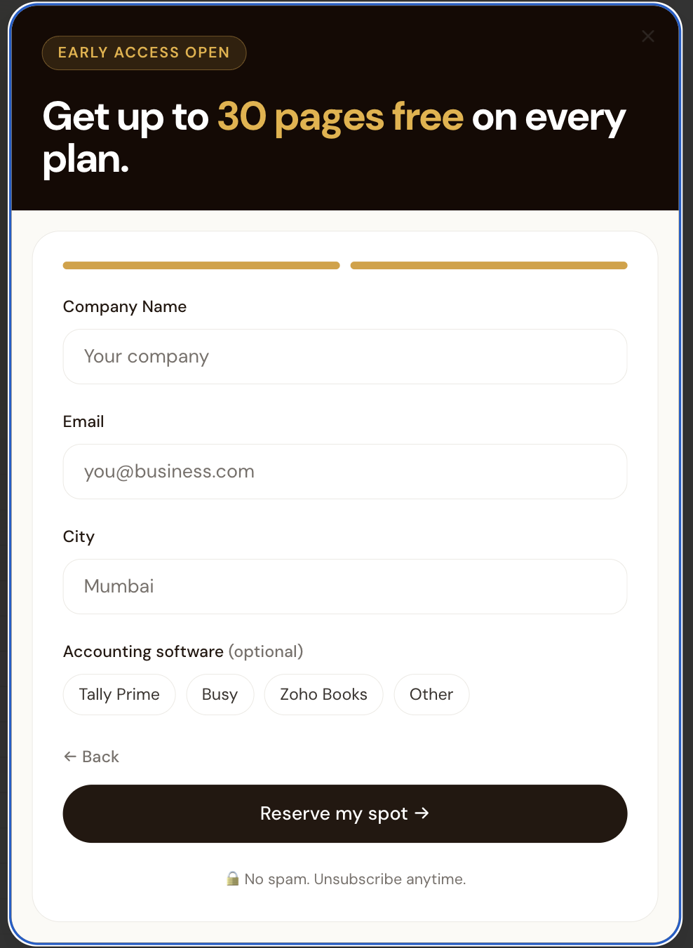
Putting six fields on a single form kills sign-ups. Putting the two easiest ones first earns commitment, then the second screen does the heavier lifting once the user is already a yes. Within a day of launch, the client closed three customers.