Brand and site for energy infrastructure that didn't fully exist yet.
Nirmaan is building the infrastructure for the energy transition — containerized battery storage systems paired with an AI-powered energy management platform called OPTIMA AI. Their customers are industrial businesses quietly bleeding money to unpredictable grid power: food processing plants, hospitals, data centres, manufacturers.
The founders, both Harvard Business School grads, with pedigrees across Tesla, Apple, Rivian, and Bain, came to me with a specific ask: build a brand and a website that could unlock grant funding and signal to the world that Nirmaan was serious, before the product was fully live.
I was the sole designer and strategist on this. The brief was deceptively simple but the execution had to be precise.
Three audiences. One site. No product yet.
Grant committees read linearly and need to feel institutional confidence. B2B customers scan for proof that you understand their specific pain. Early investors look for a team that moves with conviction. The brief was to serve all three without the site feeling like it was trying too hard for any of them.
The instruction I was given: minimal, modern, differentiated — almost like a blank canvas. Which sounds freeing until you realise blank canvas only works when every element you do show earns complete trust. So before a single page was designed, I built the brand.
Make seriousness visible before proof existed.
The work had to create enough trust for funding conversations and enough clarity for industrial buyers who do not care about pretty abstractions.
A space-age mark. A sun-like logic. Built to carry itself.
The submark is a radiating dotted sun — an abstraction of energy and consistent performance. The wordmark is wide-tracked Montserrat, cut and architectural. Together they work as a complete logo. Separately, the submark carries the brand the way the Tesla T does — no name required. That was the reference point I was designing toward.
Not generic cleantech. Deep space infrastructure.
The palette lives in two registers. Dark: near-black navy, Sun Yellow, Electric Blue. Light: warm off-white and periwinkle. The gap between expectation and reality is where the brand does its most important work.
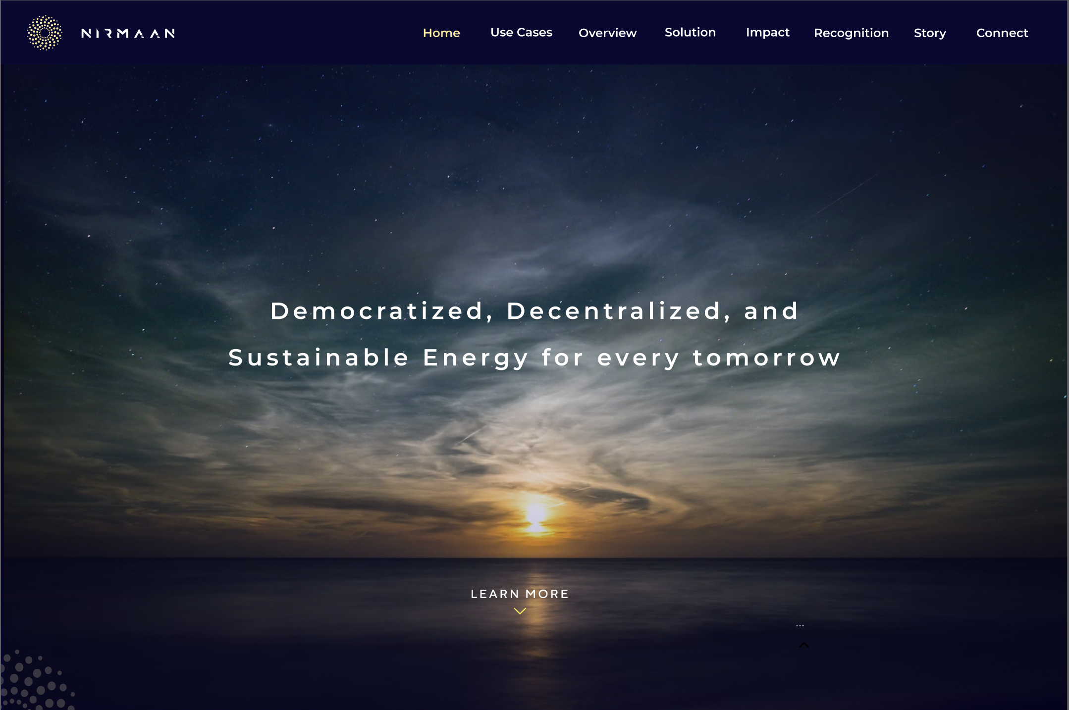
The hero is not a dashboard. It's not a product. It's a horizon.
A dusk sky over open water, one headline, a chevron. The restraint is deliberate. This is a company that believes the technology will speak for itself once you're in the room. The website's job is to get you into the room.
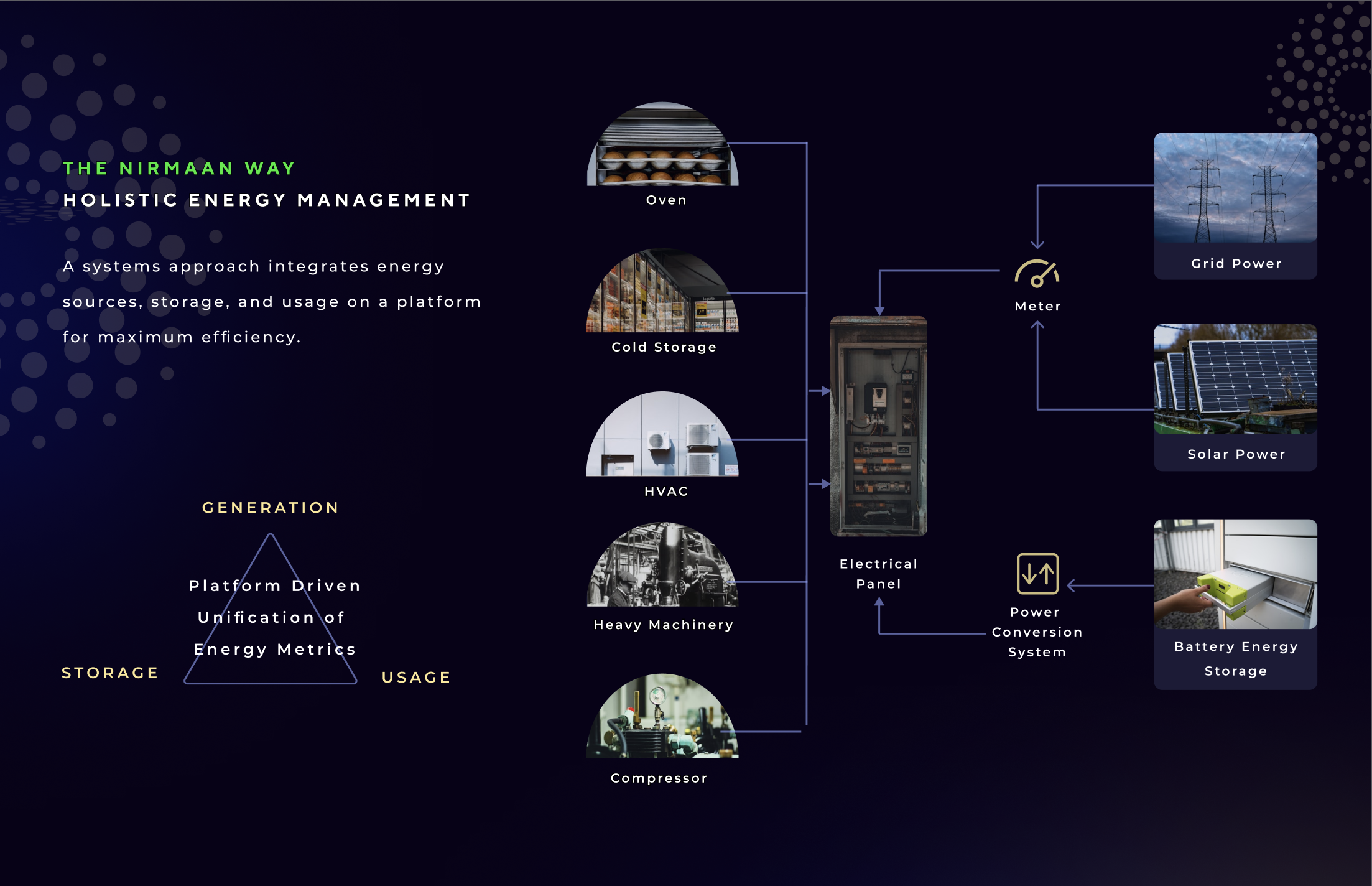
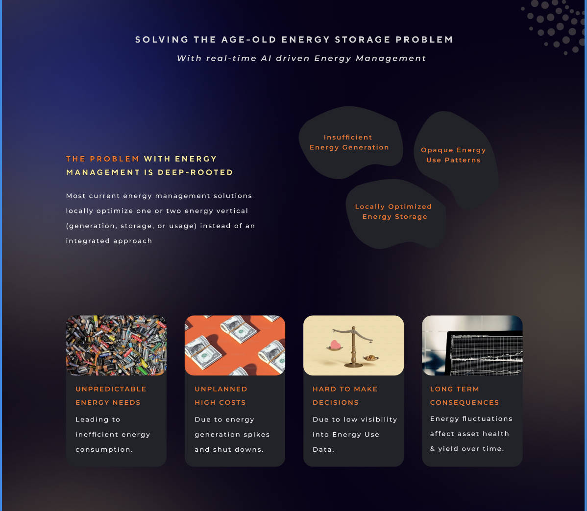
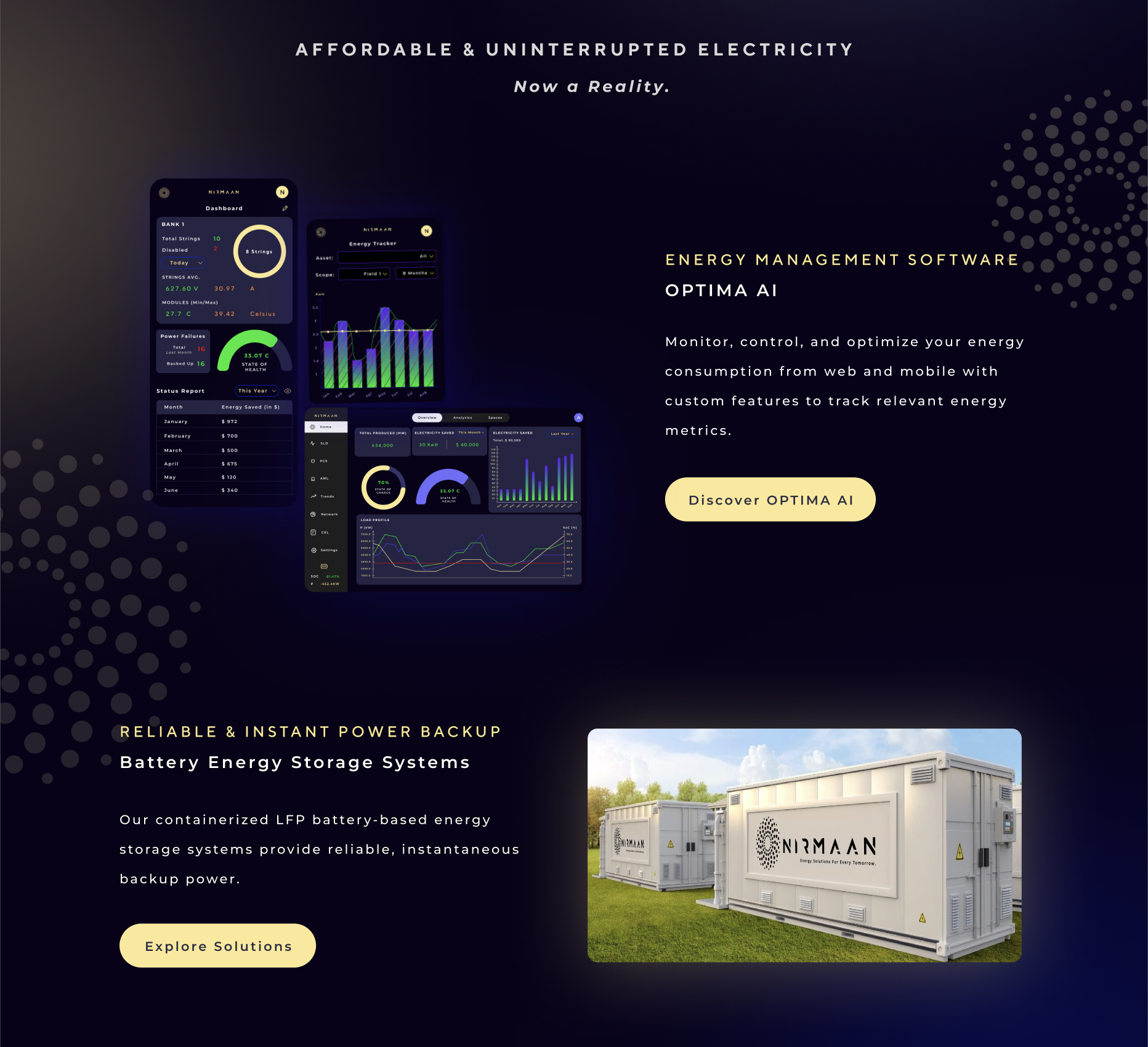
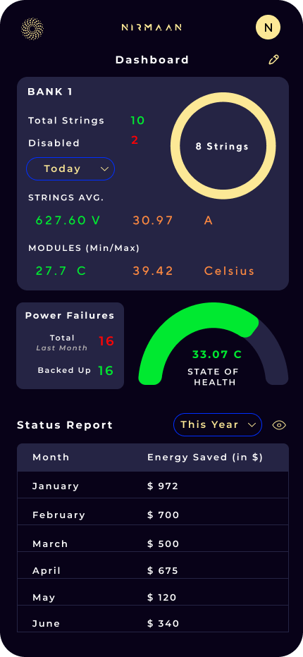
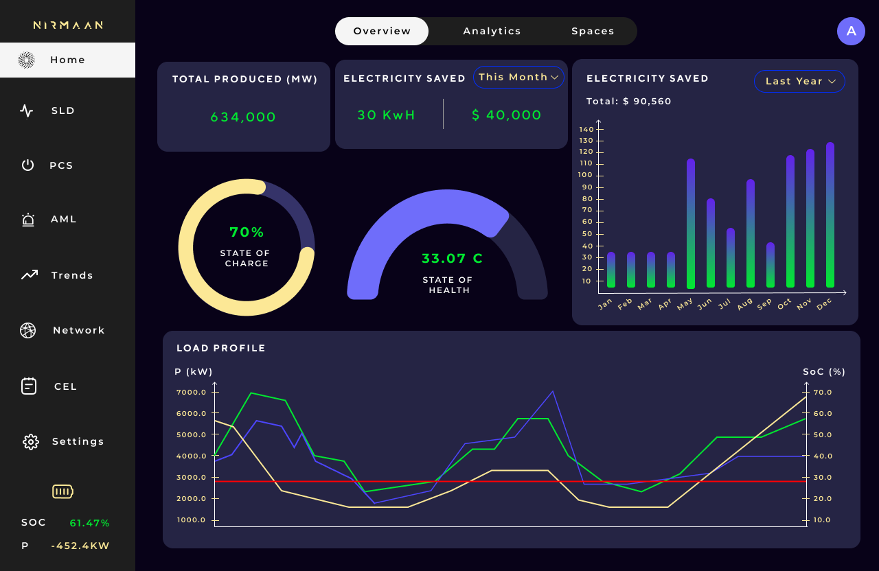
The hardest job: making battery chemistry feel intuitive.
Most people don't know what a Battery Energy Storage System actually does. Engineers speak in kWh, MW, LFP, SoC. Industrial operators speak in uptime, margin, and risk. My job was to bridge that gap without dumbing anything down.
The "Nirmaan Way" diagram was the centrepiece — equipment inputs on the left, flowing into an electrical panel, out through a meter, branching to grid power, solar power, and the battery system. A triangle — Generation, Storage, Usage — anchors the philosophy: Platform Driven Unification of Energy Metrics.
Pre-product doesn't mean pre-story.
OPTIMA AI didn't exist in finished form. What existed was a clear vision — and I designed the screens to match it. Mobile dashboard: string health, voltage averages, temperature ranges, state of health gauge, savings by month. Web platform: the full desktop experience with load profile charts and a complete sidebar of capabilities.
Every screen is hand-built in Figma, in the brand palette, to the standard I'd hold a shipped product to. Not "coming soon." The product story, drawn so a customer can picture themselves using it.
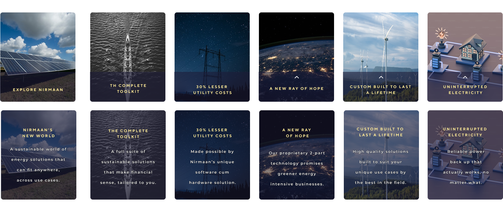
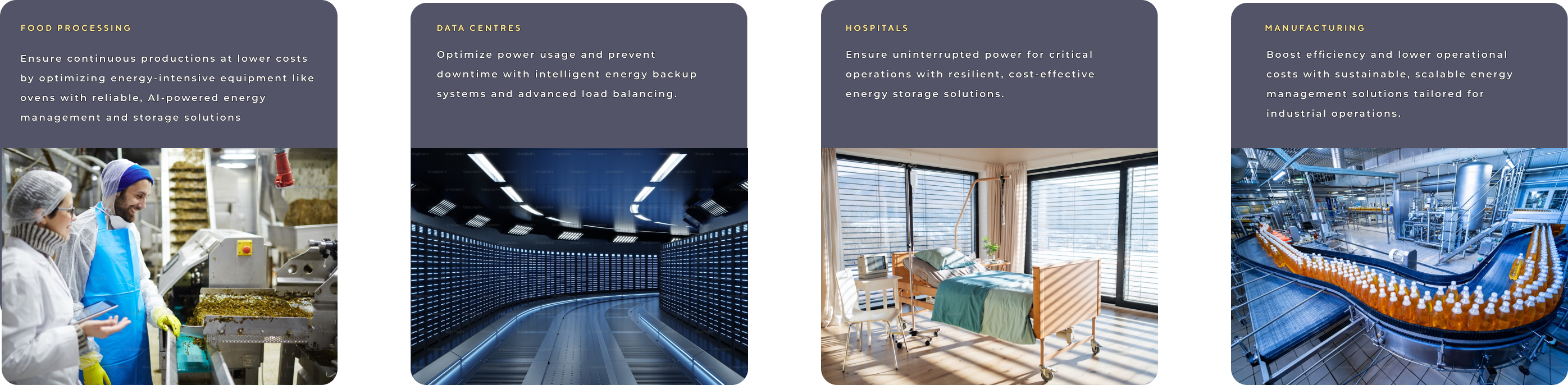
Specific verticals. Real photography. No stock illustration crutch.
The customer segment section gave each vertical — food processing, data centres, hospitals, manufacturing — its own card with a specific pain and a specific hook. Short copy. Real photography. Sun Yellow labels.
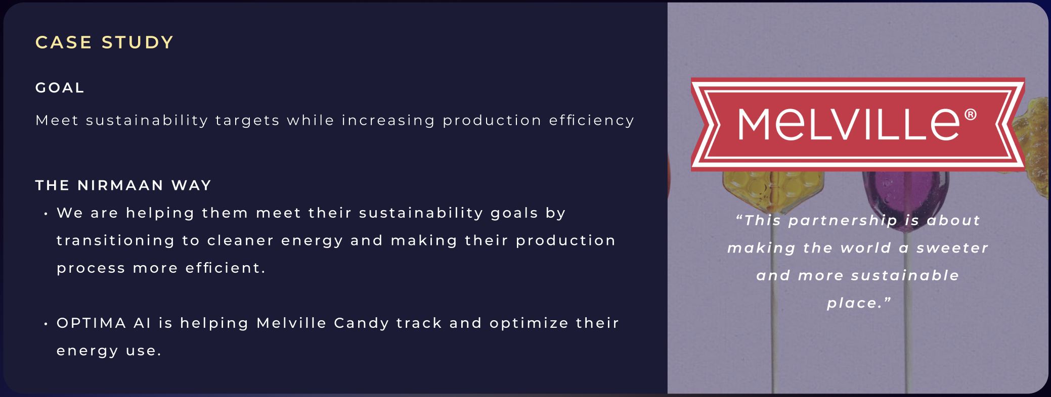
The Melville Candy case study got a split-screen section: dark navy narrative on the left, full-bleed photography and their quote on the right. "This partnership is about making the world a sweeter and more sustainable place." A real customer story, even an early one, does more work than any copy I could write.
A handoff-ready system, not just a pretty site.
Logo system
Submark, wordmark, four color variants, usage rules, SVG delivery.
Formal PDF
Handoff-ready documentation covering every decision with rationale.
End-to-end design
Architecture, layout, copy, visual system, and the full storytelling arc.
The Nirmaan Way
Built to be understood in 30 seconds by a layperson.
Mobile and web screens
Designed from vision, not from finished specs.
Plain language
Every headline and CTA. Technical subject, precise tone.
Verticals and case story
Four customer segments and one early customer story, all earning their place.